DESIGN
NYRSTAR
Nystar branding was an international rollout and included everything from Corporate screen savers to uniforms, trucks, ships and huge site signage across many countries
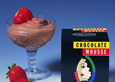
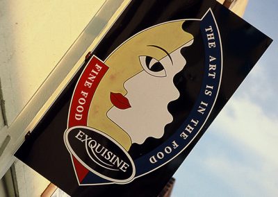
EXQUISINE
This company wanted their branding and products to reflect creativity and quality with a touch of difference.
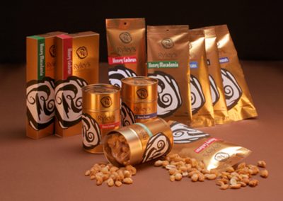
RYLEYS NUTS
A popular hot nut cart vendor wished to vamp up their branding and move their product to a much broader market. This was a complete product and branding rollout.
EPWORTH
This branding was applied to all Epworth services & medical facilities. It has maintained a long, strong identity.
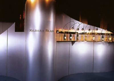
MILDARA BLASS
Design & production of Mildara Blass Annual Reports over many years along with a range of other shareholder material & meetings
TOWNS REAL ESTATE
This was a complete branding roll out for a new real estate company. It included all the signage for both web and print requirements.
STERICLEAN
We were asked to design a logo for the ‘ Northern & Eastern Hospital Linen & Laundry Service’. We designed the logo and suggested they changed their name too. You will have seen this logo if you’ve been to hospital in Victoria.
LOVE BEING ORGANISED
Branding for a business in specialising in organising peoples’ homes, garages and offices.
CARMA COHUNA
Carma Cohuna designs branding for art, textiles, graphics and corporate events. The idea was to keep this as simple as possible so it works across a variety of products and services.
PARDEYS
Pardeys is a chain of pharmacies in the Geelong region. They specialise in servicing the whole family, and are highly recognised for their compounding and history.
NOTTING HILL HOTEL
This is a close up of the Notting Hill Hotel logo that merges the heads of three chooks that also resemble oak leaves.
NOTTING HILL HOTEL
This was a new image development for the hotel’s renovation. The branding needed to reflect parts of the hotel’s history, which included a big oak tree and chooks that freely wander the beer garden.


